
Anna the Baker
Designing and Implementing the website for a home bakery
The Design Process and My Role
One thing I always wanted to do, since my early days at Stony Brook University, was be a freelance web designer. Now in 2023, I have been freely pursuing these goals by reaching out to local businesses that are seeking viewers, clients, or merely a larger audience, and offering my experience in creating content, optimizing SEOs, and managing an online presence. While this may not be the most traditional of case studies, I hope that this piece gives you some perspective on my design philosophy, my passionate and resilient nature, and my ability to bring the visions of these professionals to life.
Anna the Baker:
Finding my Opportunity
Anna is a self-starter, a home baker that began selling her cakes on the daily through social media platforms and a strong sense of entrepreneurship. She took her passion for creating beautiful desserts and started her own business in Nebraska, thriving by providing her local community with pastries for a variety of occasions and catered events. But to really make her business more official, she wanted a website that could help field these incoming orders and provide people with a solid platform to discover her brand.
This is where I came in. Anna was seeking an expert for the technical side of things, so when a networking opportunity connected us to each other, it was a golden moment to help both of us further our career goals. She wanted more exposure and a sense of solidity in her bakery, and I was looking for a chance to showcase my designs for an honest and true business. I jumped at the opportunity to show her what I could do. This project was a 6 week undertaking from initial concept to final design, running through ideas and scheduling time to focus on iterating the best possible aesthetic for her vision.
Researching the Market
After we decided to work together, the first step for my process was to do some initial research on what the world of bakery websites currently entailed. How did people accept their orders? What information did Anna need from customers? How can I best showcase her work to the masses? To answer these questions, I scoured the internet for the best and most effective websites that I could find.
Inspiration and Competitor Analysis
When looking at bakeries across the country, I only found a handful that had elements I wanted to pull inspiration from. Sweet Somethings, pictured left, had a simple header design I liked a lot and a dynamic photo gallery that I wanted to take elements from. I loved the pastel colors of Colarusso’s (center) and the way such simple iconography pulled their selection of offerings together, and I definitely wanted to take inspiration from that palette. Lastly, Sugarplum Bakery (right) had a simple yet captivating layering effect on their header I loved as well as really funky transitions between their various sections I wanted to emulate as well.


Core Component: Gallery
a bakery display
One of the essential elements to an effective web design is to translate the user’s experience to what they’re familiar seeing when they encounter the company in their everyday life. To sell on the idea of a bakery, I really wanted to give the cakes their moment and bring the user into the atmosphere in their memories. One of the things I loved about this company’s design is how inviting their sitewide header was, and how it created the platform for a clear, center-aligned navigation. I’ve personally been a big fan of central navigation, especially as there are only a few separate pages to this design, so I pulled a lot of inspiration from Sweet Something’s style here.

User Profile & Experience Objectives
There were two types of individuals that were likely to visit Anna’s webpage: those who knew and loved her work already and were trying to reach out, and new eyes that wanted to check out her past work and potentially place an order themselves.
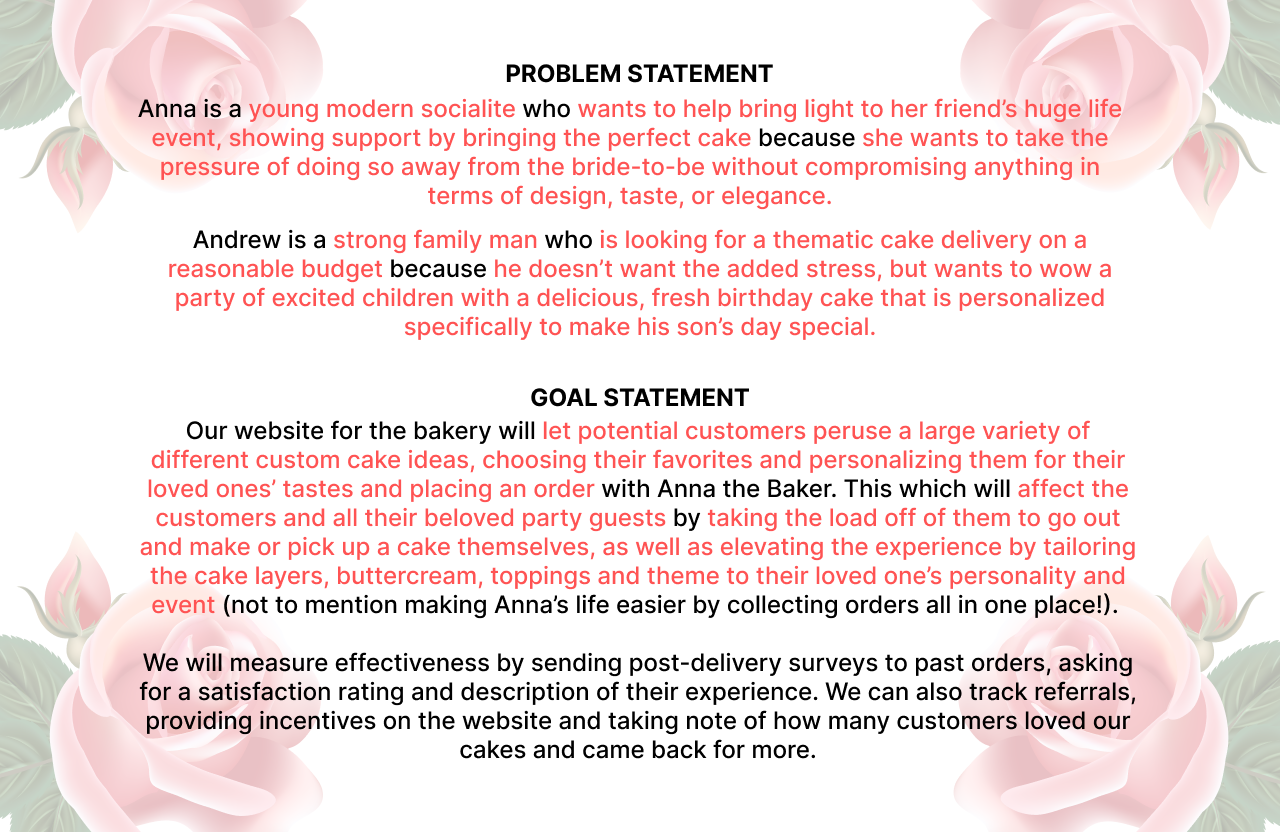
The best thing about birthdays, is that every single person has one. The clientele therefore is a very wide range of any age, occupation, and financial status. These customers are bonded together not in traditional means like class or race, but in emotional needs and intention. The average user is trying to be a thoughtful, caring individual for a special person in their lives. The average customer is trying to provide a custom celebratory experience for a loved one, to bring personality into their desserts. There’s the potential traits of wanting to support a local business, being a family-oriented individual, and being in the state of Nebraska, but for the most part the focus for me was to appeal to the same mental and emotional qualities of the individual first and foremost. I wanted to look towards their experience with their loved ones and give a sentimental, almost homey feel to my designs as well.
I used information from Anna’s past orders to gather knowledge on what the average customer would be, therefore the average user we would be catering to. From my research, I discovered that 85% of the orders came from people between the ages of 20-50, and over half the orders came from those under 40. From Anna’s perspective, there were two general groups of individuals that placed orders. Family-oriented suburban middle class individuals, and young millennial/Gen Z women catering for events. I used a mix of her knowledge and U.S. average statistics to produce these two user profiles, then mapped out their ideal user journey interacting with the website. I tried to think about each action we would want a user to take, from the moment they were introduced to Anna to the moment they confirmed their order, then I broke it down to what their perspective and emotions would be to highlight areas of importance and improvement. In the end, I arrived at a basic problem statement and a solid goal for my design.


User Experience: Goals
Goal #1: Brand Identity
We wanted to really expand on the social media branding that Anna put in place, giving her brand consistency in palette and tone as well as providing a landing place for new viewers to find her work and contact form throughout the internet.
Goal #2: Showcase the Baked Goods
The biggest priority was to showcase the variety of styles, colors, themes, and tastes that Anna could create with her delicious cakes, so we really put a key emphasis on creating a gallery of her past work that is catered to SEOs and becomes easily searchable.
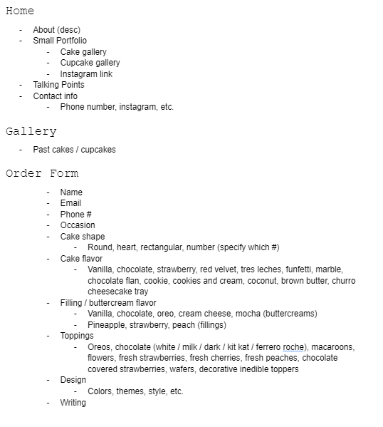
Goal #3: Order Forms
The end goal of the user experience is to have potential customers funnel through some sort of contact form and essentially place an order with Anna’s bakery, so naturally the final step was to create a clear, concise order form that still provided all the necessary information Anna needed to give them a catered dessert for their special occasions.
Deciding the Hierarchy
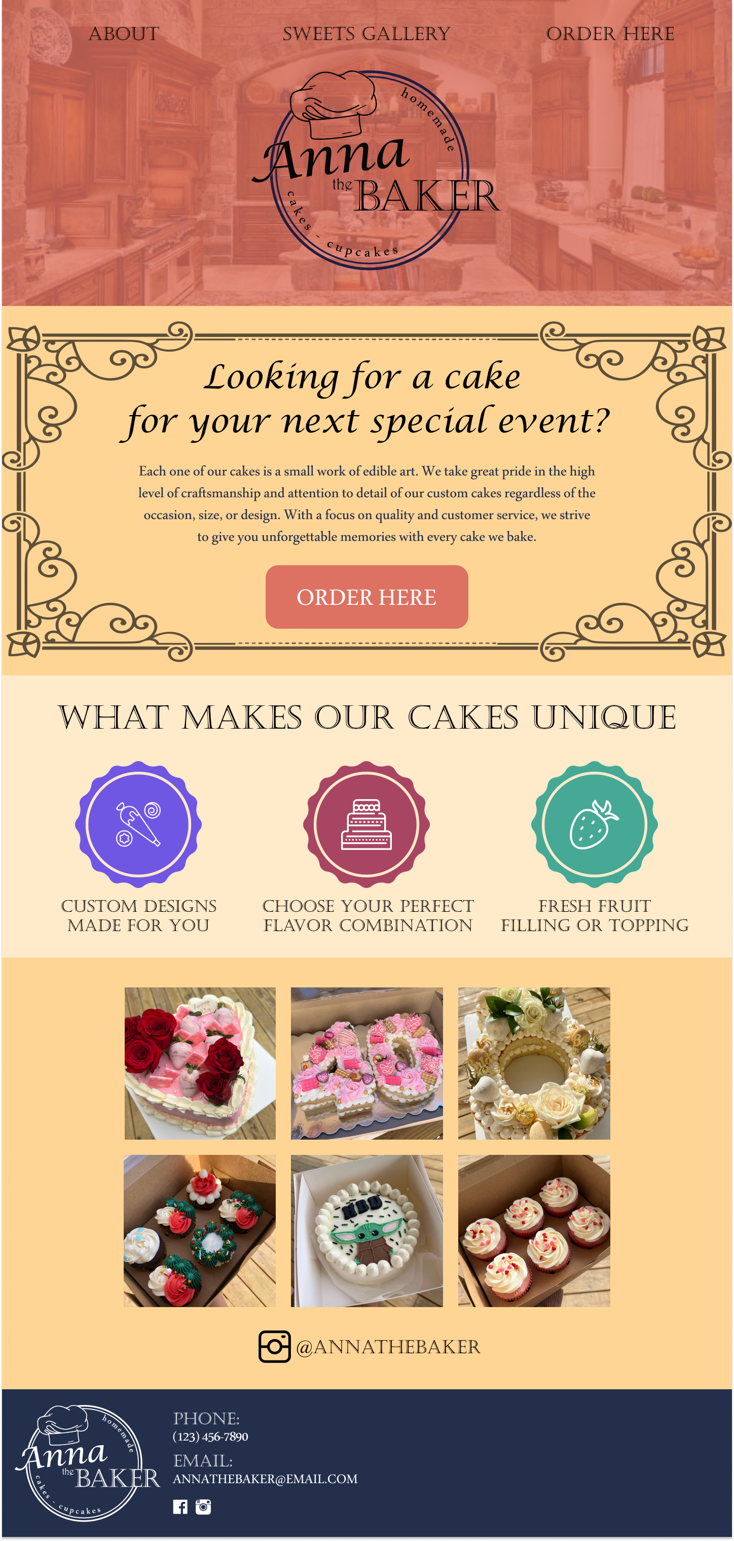
For this website, I went with a simple three-pronged hierarchy. A brand home page, a gallery for the various sweets, and an order form. This makes it super simple, which is exactly what we’re aiming for to effectively and efficiently bring new customers and provide a gateway between these new eyes and the master baker herself. After approval from Anna, I began my process designing the brand identity and working in Figma to provide the best designs possible.

Brand Design:
Colors, Graphics, and Aesthetics
My first task was to nail down a new logo for her, to set a tone for her brand. To do this, I researched a lot of existing bakery logos and mock logos and played around with a few interesting styles. We first decided on a circular shape, as it would play best with Instagrams profile sizes, and then tried a few different ideas. The typography we chose was intentionally more handwritten for her name, giving a more comforting and approachable look to the logo as a whole. Her specific request was to make the logo feel modern and clean, so the spacing between the subtitled words circling the name was upped to give the logo more breathing room. Lastly, the chef’s hat breaking the circular rim gives the logo a little more character and dimension overall.
Here, I provide a few of the logos I referenced, a few of the small mock ups we played around with, and the final version of the logo we ended up going for. In the earlier renditions without the break in the circle that the hat creates, you can see how the design looks more stiff and put-together than the final design we settled upon. I created this logo in Adobe Illustrator, where I could easily customize the various fonts and shapes as I worked.


Next, we ran through a couple of iterations of what the potential color scheme and iconography would look like throughout the website. Initially, we were looking at a very summery, warm beachy palette focused on the golden colors of a pastel yellow and bright orange. But as we designed, we later shifted our focus to highlight a lot of pinks and warm purples and flipped to a more floral, modern look. See below for the Figma designs!
Figma Breakdown
The first attempt was a very Spanish inspired summer design, with a clear layout breaking down those three pillars in a concise hierarchy to lead the eye. I wanted to cut all the frills and focus on the pastries themselves, highlighting their images as much as I could. When we went over this design, she especially noted that she loved the logo, the live Instagram feed, and the various verbiage I used when writing about her desserts.
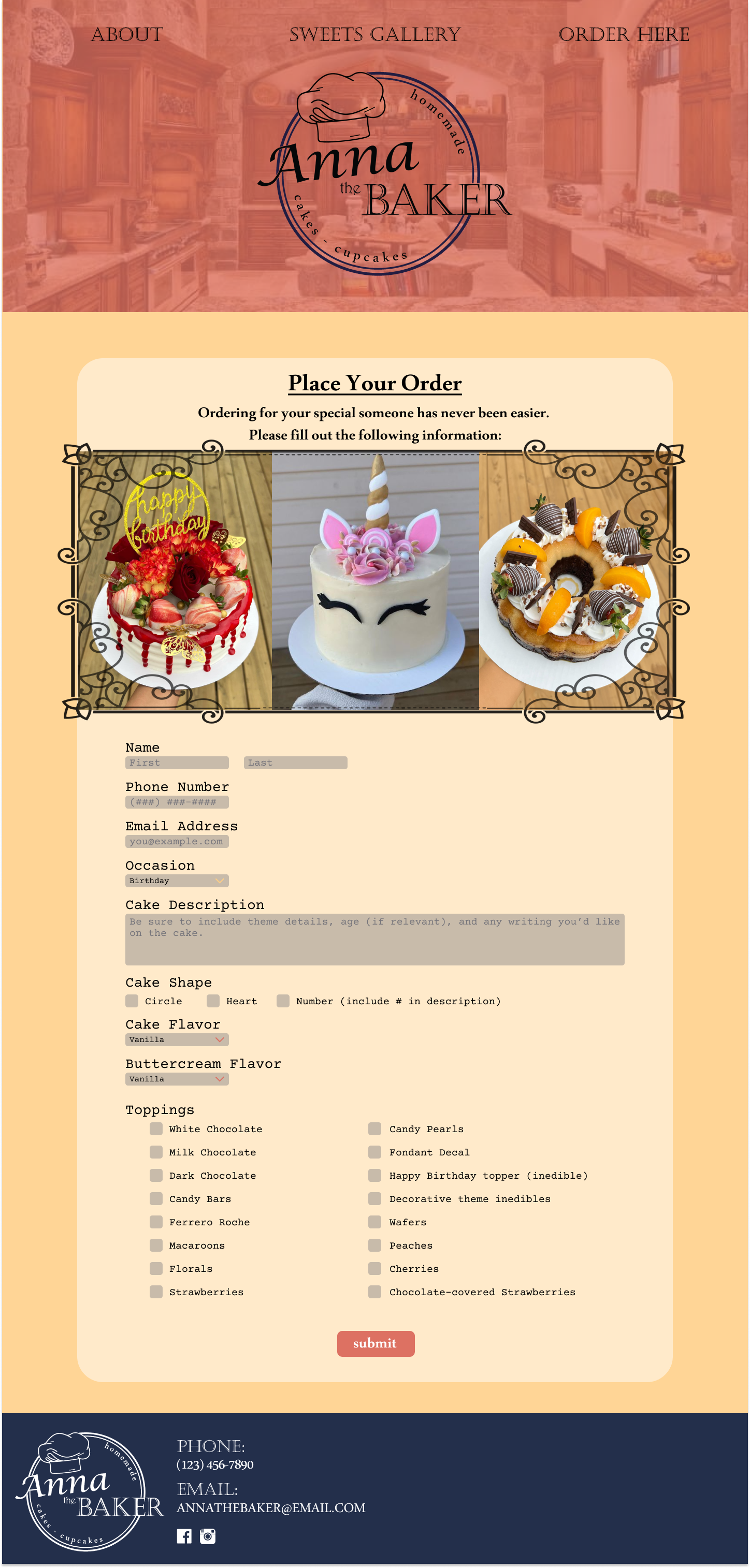
One of the biggest wins of the initial proposal was the Sweets Gallery. She loved the way I broke down her cakes to their various attributes, to really give her customers the full range of her abilities and show them some of the many possibilities they have with customizing their cakes.
Another big win was the idea of changing the background of the photos when highlighting the cakes. As you can see in the gallery, compared to the photos in the header of the Order Form, the wooden deck and boxes behind the cake itself have been filtered to show a variety of nice pastel colors. This was to add character to the photography, as well as bring out the coloring in each of the cakes themselves. I used Adobe Photoshop to create this effect, and we both really enjoyed how it transformed the page.
Another one of the big wins of the design was figuring out the layout of the order form. Some options, like the cake flavor, buttercream, and shape, we wanted to limit to a singular choice. I went with a radial design for the shape and a dropdown for each flavor, to showcase the options more aesthetically. But for toppings, where customers could choose as many as they pleased, we wanted to showcase as being a robust selection, so we went with a checklist. All in all, I like how the form looks to the eye, and most importantly it attains all the necessary information!
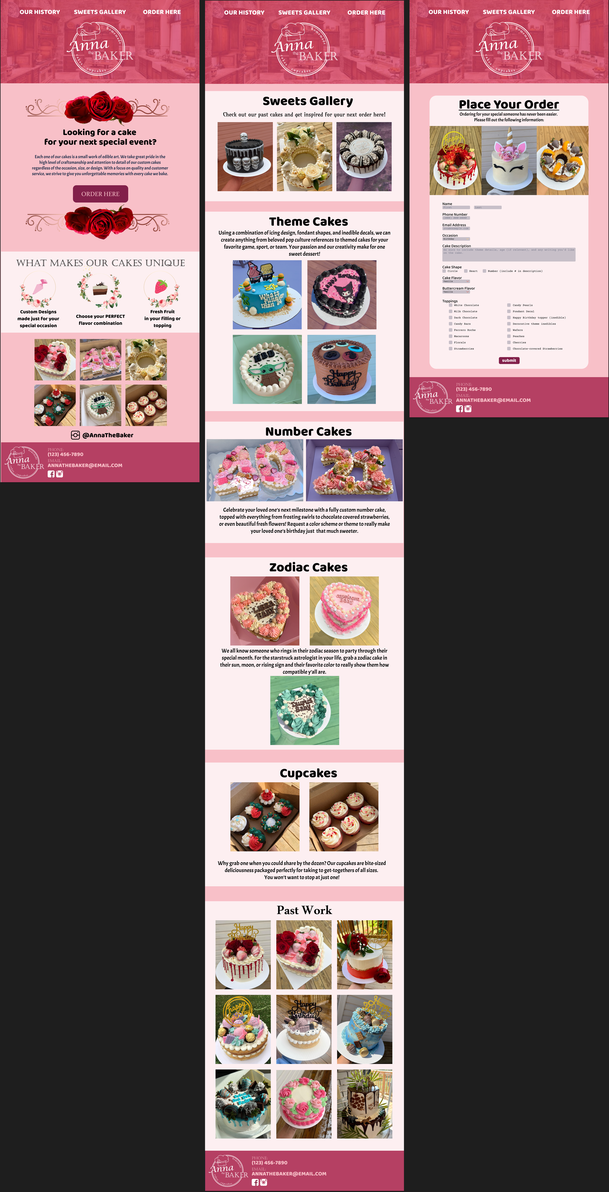
But of course, with every design comes iteration. The biggest shift from this point was that she wanted to change the theme from a summery color palette to a more traditional, rose-influenced color palette. This entailed a lot of various pinks, and more iconography depicting various rose details. She also wanted, with this, to change the font to be a more bubbly, modern font which would play into her vision for her brand. Of course, these being aesthetic changes, they were straightforward to adopt in the next iteration of design.

Iteration 2: Catering to Initial Response
However, there was still a lot we could improve. I created new icons for her main talking points as a baker, as well as used photoshop to turn photography of red roses into a simple wire banner to use on the home page. As I formerly mentioned, we wanted to make that shift thematically and add a more youthful look to the page as a whole, so the color palette and font made a huge difference here. I turned these still images into a functional prototype within Figma, and gave her version two of her vision. Luckily, when presented with this version of the design, she loved the changes I had made and the overall look of the website. Some of the smaller details, such as which photos were presented in which location and the exact layout of the header, would be worked out along the line, but the heavy lifting was complete! Check out the full design to the left.
Hosting the Website: SquareSpace
Being that Anna wasn’t going to require my ongoing assistance, she benefitted best from a platform that allowed her maximum control, with the most straightforward UI. I talked her through various hosting options - WordPress, Wix, and SquareSpace being the most common, and we decided a simple SquareSpace layout would fit her needs adequately. So I put my design online for her using the Business account of the site, which translated well but not exactly as envisioned. We ended up moving the header links to below the main logo image, like in the reference photo of the Competitor Analysis and changing it’s image, but the design otherwise stayed intact. We then linked together her Instagram and social media, and added a little bit of flair between sections on the main page. All in all, I was very happy with how the design looks, despite it being on the more limiting platform. If you’d like to see the page for yourself, check it out with the link below.
SEOs
The next step was to set up the various SEO features of the website. Titling the pages, adding quick descriptions, and tagging the site throughout with optimized keywords to help visibility across search engines. Every photo in the website has an adequately named title/description, which will help search engines filter the page to related search queries in her area. Furthermore, I paid deep attention to the wording used throughout the text segments of the website, particularly within the first 50 words. This will help promote visibility for related terms like “edible art” and “special events” on top of “cake”, “bakery” and “pastries”. For future iterations, we implemented a post-service survey that users can complete that will give Anna a CSAT score to gauge how the website is performing to their standards, so that in the future we can pinpoint pieces of the user experience that we can improve upon. This was a straightforward process that allowed Anna the maximum amount of viewership and opportunity to draw new eyes to her page, especially in her local area where she needed it the most.


Final Design and Takeaways
Overall, the design was a huge success. Anna and I worked together well to create a functional, beautiful, and delectable-looking webpage for her bakery, complete with a history main page, a sweets gallery to highlight her cakes and cupcakes, and a working order form that sends users to the email of her choosing for further contact. I’m ecstatic to put this page under my belt, and to use this as a launching off point for future freelance endeavors that come my way.