DFINITY Help Center
Redesigning a webpage to best fit the needs of a variety of end users
The Design Process and My Role
While at the DFINITY Foundation, I took it upon myself to volunteer and lead an initiative to redesign our Help Center and associated webpages to encapsulate our content in a more visually appealing and more efficiently organized way. This process will talk ideation to implementation and execution; beginning with recategorization of the existing content and articles, and ending with the visual design for a more modern, sleek look that better matched the existing branding.
The team granted me full ownership of this process, from the necessary research to the implementation of custom code within the Zendesk framework to highlight key components of the our Support Content, whether that be the articles or video tutorials that we provided. I worked within HTML, CSS, and JavaScript to add elements such as hover animations and dynamic formatting for the video showcase and collapsible side navigation bar.
Where we started: Defining the Problem
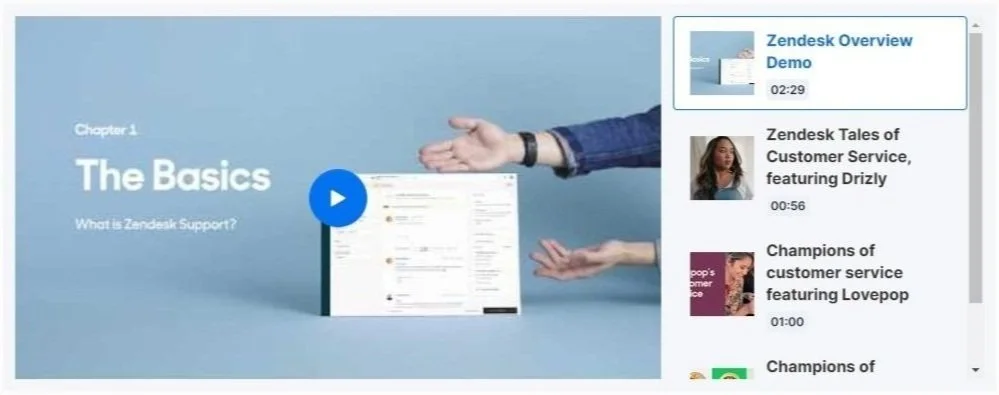
When I had first joined DFINITY, their Help Center was nonexistent. The bare minimum was haphazardly put in place (pictured left) and a lot of the features were based on the default given by Zendesk. The promoted articles section would populate the most recently posted articles automatically, and the recent activity was tracking end user comments and upvotes that did not exist. The categories given were either too specific and didn’t leave enough breadth to effectively house articles, or too vague and encapsulated too many topics to be intuitive for those searching for help with a specific process. Oftentimes, if a user didn’t immediately find their relevant article, they would default to sending a support ticket even when the answer was present on the website.
One huge goal in this redesign was to focus on helping the user, beginning from the actions and processes they would likely have questions on such as token custody, staking ICP, or developing on the Internet Computer. Another goal was to ensure scalability with the design, so as more content was created, there would be a home for all future developments and features.
Key Elements & Goals
As stated before, the reorganization of the 50+ (now 75+) articles was the first priority, to best serve our end users.
Goal #1: Intuitive Organization
Goal #2: Video Tutorial Showcase
The video tutorials created by me and my team were quickly growing in number, and as they were so crucial to minimizing tickets, it was best to give them a home on our page.
A lot of the features our default page had were unhelpful and distracting to those trying to get technical support, so a large goal was to remove sections like “Recent Activity” and features like comments on our articles.
Goal #3: Reduce Clutter
Identifying Users & Mapping User Flow
Luckily, after having so much time in Support before taking on this project, I had a very clear picture of the types of users that frequented the Help Center. They fell into three major categories: those troubleshooting staking/voting/custody, those seeking development and hardware help and information, and those who are brand new to web3 trying to learn more about what we did at the foundation.
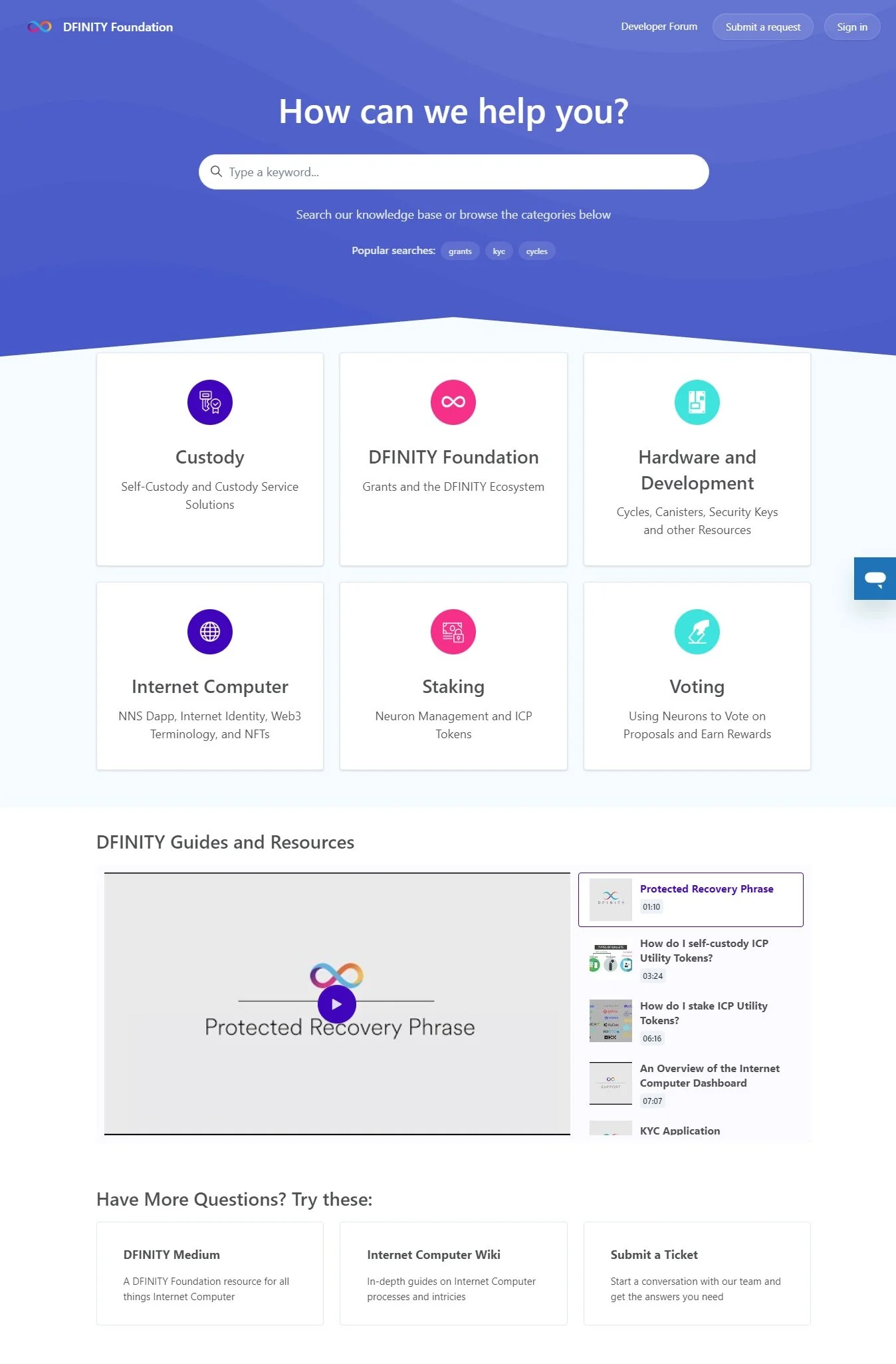
With this in mind, there was a clear plan to appeal to all three groups of individuals using specific Categories that targeted the various use cases. DFINITY and Internet Computer highlighted specifics about the organization and product, while Hardware and Development could house all developer resources. Staking, Voting, and Custody could funnel those looking to troubleshoot into the specific processes they needed help towards in the most intuitive way.
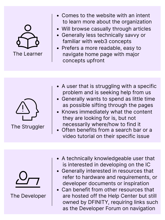
Pictured right are Provisional Personas of the user base I kept in mind throughout the design process. Pictured below is the User Flow for all types of end users that I created for this project.
Inspiration and Competitor Analysis
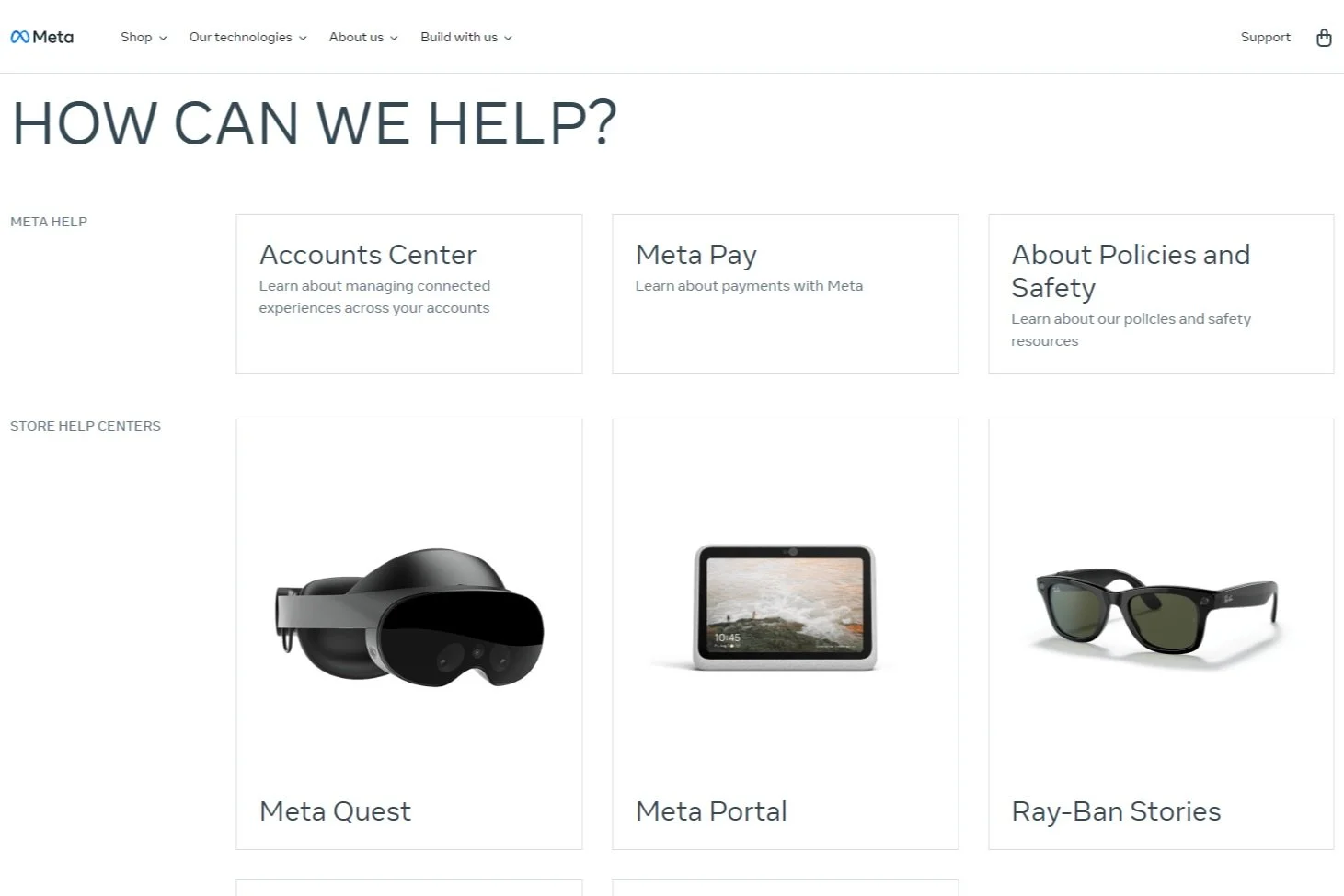
The next step for my process was to take note of what other similar tech companies and help centers were using to best guide users toward the topics they needed. For this design in particular, I loved Shopify’s use of simplistic icons and Google’s use of sections that directly funneled to the Support Ticket system and feedback loop. I pulled inspiration from all three of these to best fit DFINITY’s needs.
Wireframing and Prototyping
The wireframing for the new categories had to follow the processes and topics that users would be flocking to the site for. The main processes that end users would come to us for would be Staking, Voting, and Custody, which were simple enough to break down. The more ambiguous topics like DFINITY and the Internet Computer took some research to break down, first looking at the articles we’ve created then doing some digging as to which were the most commonly viewed, therefore were more prioritized. Lastly, we had to take a look at the biggest developments that DFINITY was working on, so we knew where to expect content growth and could plan accordingly around these new features.
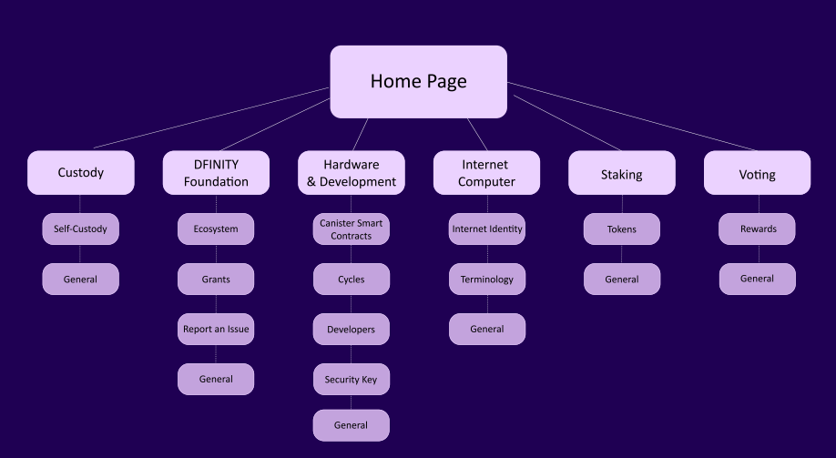
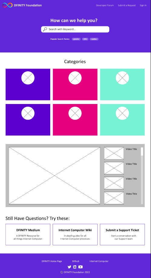
Note: Unfortunately, direct files of this Figma prototype are owned now by the foundation and cannot be included, but here I have included the basic hierarchy that I landed upon and screenshots of the files I have, which are extremely similar to the final product.
Deciding on and designing the icons relied firstly on my knowledge of the topics and hardware at hand (e.g., custody using public and private keys to lock up tokens), then on the design and branding already existing within DFINITY. At this time, DFINITY leaned very heavily on a purple/white color scheme, so I created a handful of clean, modern icons to signify the various categories needed (displayed right).
Iconography
Video Showcase Options
Since the video tutorials were such a key tool for Support, I really wanted to showcase them in a way that was easily accessible for end users, but didn’t clutter the website. There were a few options that we tried before landing on the final design. The first was a grid layout, but the issue with this format was that it didn’t scale well as the number of videos would constantly increase and the page would only expand farther over time. However, the carousel layout was restricting as users would only be able to see the first few videos, and it was not very user-friendly to sift through so many options before discovering a relevant video. So the final choice was made to provide a small side library within the lightbox, and this has seen quite a lot of success in the final design.
Usability Testing and Data
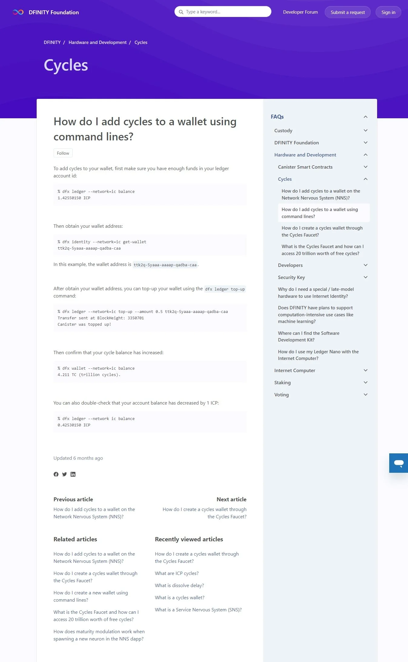
This redesign went further than just the home page of the Help Center, as there were also pages for individual Categories and Articles to think about. Some new features added were sections like “Related Articles” and “Recently Viewed Articles”, but to really gauge the success of these we had to look at the data.
We were consistently tracking user behavior using Google Analytics; we found that the addition of related articles raised the time spent on the help center by upwards of 10%, and the number of web pages visited per user more than doubled since the implementation of these two sections.
After implementing some A/B testing paired with survey feedback loops, we also found that users preferred a collapsible side navigation bar rather than a more straightforward but lengthy navigation option, so our final design reflected this.
Some visual changes that were made also include minimizing the amount of bold colors to create smaller accents that draw attention without detracting from uniformity, and adding a more muted, dynamic design to the header to create a more modern, sophisticated look.
Final Design and Takeaways
Overall, the final design has seen major success. The website’s unique users rose over time to a peak of over 1500/month, and across the help center, the amount of pages users read more than doubled. As more videos and articles have arisen, categories remained successful and subcategories grew as needed. A huge learning opportunity for me, this project was a large undertaking that pushed me to think a lot about the product we were creating and the different ways consumers interact with the Internet Computer, and tailor the experience on our site for the variety of individuals that come seeking resources.
The opportunity to bring some of my web developer experience into a role that didn’t necessarily require that was thrilling and challenging, and I really appreciated the amount of freedom working at a start up gave me in this situation. The redesign of this site required knowledge of content management systems like Zendesk, as well as a foundation in HTML, CSS, and JavaScript for coding the more complex features.


